Forex Charting – An Introduction to Forex Charts
The principal tool used by the Forex technical analyst is the Forex chart. All Technical Analysis is based upon the reading and interpretation of chart data.
Traditionally followers of technical analysis where called ‘chartists’ due to their use of Forex charting to forecast future price acton.
The Forex chart is used to study historical price action of the markets in order to seek to identify future movements and ultimately an entry or exit of a a trading position.
While all Forex charts show the same historical price information there are variances in the way that they display this information. The most widely used chart types for Forex charting are the Line chart, the Bar char and the Candlestick chart.
Each of these chart types is able to display price information over popular time frames; 15 minutes, 30 minutes, 60 minutes, 240 minutes, Daily, Weekly and Monthly. Shorter term traders may even use them to examine shorter periods of granularity in the market, using 5 minute or even 1 minute charts.
Each type of Forex chart has its own merits and the one you use will ultimately come down to your own personal preference.
Below we give examples and a summary of each Forex chart type.
Line Chart

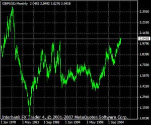
The Line Chart shown above is the most basic of the three chart types. It displays data by simply connecting a series of data points such as the closing price, with a line. Line charts give a good general view of currency pair trends and market direction which we cover in the next lesson. The basic construction of the line chart does not give any open or closing price information or any indication of the price movement during the course of the trading timeframe.
Bar Chart

The Bar Chart gives the trader more information than the simple line chart. As you can see from the example above, visually we can see both up days and down days in the market by the colour of the daily bar. We can also see where the market opened and closed for the day. The bar itself shows the trading range of the market during the give timeframe. This additional information is invaluable for a trader looking to take a position. Let’s take an expanded view of the Bar Chart and examine it more closely.

In the example above we have zoomed in on a Daily Bar Chart for the EUR/USD. Here you can clearly see the open and close of the bar. This represents the opening and closing price of the market during the selected timeframe, in this case one day. The bar itself also shows us the high and the low price that the market reached during the time frame.
Candlestick chart

Candlestick charts are possibly the most popular of all chart types in current technical analysis. This is because they provide an instant visual ‘picture’ of the market price action which the line chart and the bar chart cannot. Of the three principal chart types, the candlestick chart provides the required information in a way that is most readily visually interpreted.
Candles are displayed in different colours depending on whether the price action closes above or below the opening price. On the above example the candles where the market finished up from its opening price are shown in blue and where it finished down in red.
While the information provided by the candlestick chart (high, low, opening and closing prices) represents the same information provided by the Bar Chart it is much more discernable. The key benefit is that each candlestick shows us the interrelationship between buyers and sellers in the market. This in turn helps to give a more accurate picture of the immediate price action.

Each candle is constructed of a ‘body’ and a ‘wick’. The top of the wick and the bottom of the wick represent the highest and lowest price that the market traded during the selected time frame. The body represents the distance between the opening and closing price of the market.
In the chart above we can see that the blue bullish candle closes higher than it opens. The top of the candle’s body is where price closed and the bottom of the body is where the price opened. For the red bearish candle the top of the body is where the price opened and the bottom of the body is where it closed.
Candlestick analysis is a specialist branch of Forex charting and we suggest that equipped with the basics, you now read further on the subject.
No matter which chart type you use for your Forex charting, the selected timeframe of the chart will determine what each bar or candle shows. If you select a daily chart, each candle or bar will represent a days worth of price action (24 hours). If you select a four hour chart then each candle or bar will represent 4 hours of price action and so on.
Next: Forex Trends


